Supply Chain
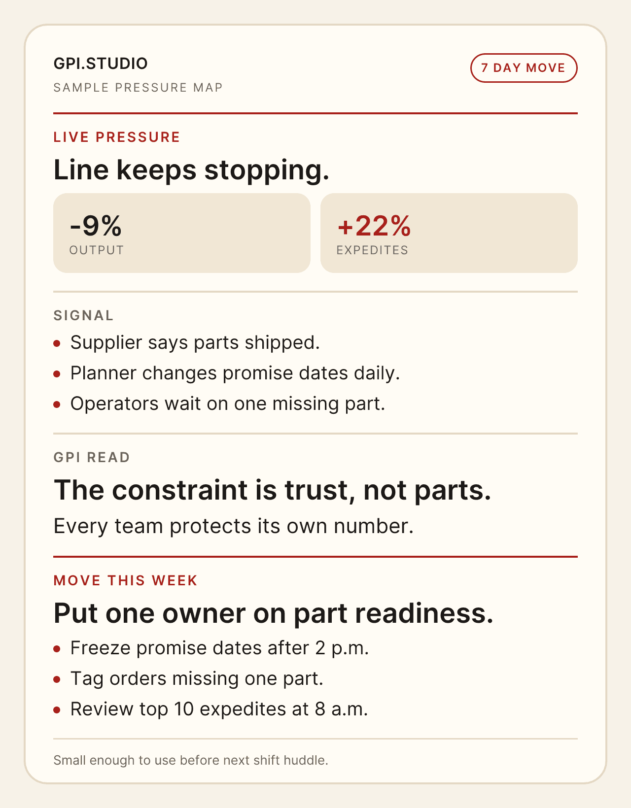
Line keeps stopping.
Output is down. Expedites are up. Every department can still explain its number. The map makes the team stop arguing about blame and put one owner on part readiness.
Good. That means it found the part people keep talking around. Public samples are cleaned up. Real maps carry names, waits, workarounds, half-owned decisions, vendor promises, missing proof, and the part no one wants to write in the status update.
If the map works, the next move gets smaller and less dramatic: one owner, one check, one stop, one path to test, one bad habit left on the table.

A good map usually starts from a screenshot, a queue, a late shipment, a stuck approval, a bad handoff, a rework pile, or a sentence the team keeps repeating.
| Clean number, dirty work | A metric improves while the floor feels heavier. |
|---|---|
| Fast demo, slow ownership | A pilot works before the operating burden has a home. |
| Many true stories, one stuck system | Every team is right inside its lane while the customer waits. |
| Meeting gravity | The decision keeps coming back because no one owns the next cut. |
A map gives the room a hard surface. Put the pressure down, mark the ugly part, leave with a move small enough to try before the next meeting.
Line is down again. Visit is booked, but care still stalls. Pilot looked good, but the work after launch has no home. The map makes the stuck part harder to dodge.
Output is down. Expedites are up. Every department can still explain its number. The map makes the team stop arguing about blame and put one owner on part readiness.
A demo can make the room nod too early. The map keeps the ugly middle on the table: training, support, maintenance, control, and the bill after launch.

Not a profile. A quick operating read before a team falls in love with the easiest story.

The appointment exists, but the care is not ready. Code mismatch, wrong plan, missing note, payer callback, patient moved again. The map catches the chase before it becomes normal clinic work.
